Send us your art
Need to get a file though to us? Do it the easy way; upload it online and never have to leave your seat.
Your file should be a print ready pdf with bleed and crop marks or a zipped/compressed archive packaged file of all the fonts and links. Our PDF specs are listed below.
This form is limited to a maximum file size of 500Mb.
Trying to do an upload larger than this will only result in losing all the information and the upload failing.
FTP Access
If your file is larger than 500Mb we have an FTP (File Transfer Protocol) service. Email Ben for further information.
See file specs
Terms used in printing
Crop Marks
Crop Marks are thin lines placed on the corners of a document, image or artwork layout to indicate where the paper should be trimmed after printing. Crop marks are important for any artwork, especially if the design will have bleed. The crop marks should be beyond any bleed, and at least 3mm outside the trim area.
Bleed
Bleed is the area beyond the trimmed edge of the page. It should be a continuation of any content that is 'at the trim edge'. Bleed is typically required to extend 3mm past the trimmed edge, (or more for large format printing). This ensures that when the document is trimmed, the design ends on the edge of the page. As printing is a manufactured process, slight variations in trimming are part of the process. If there is no bleed, the likelihood of having a white strip on the edge of the finished product is high.
Packaged File
Both InDesign and Illustrator have a 'Package for Output' feature (in the File menu). Use this to ensure that image resolution and colour spaces are correct, that fonts are available and can be embedded, that graphics are up-to-date, and so on. It will create a folder that should (depending on any settings you adjust or warnings you ignore) contain everything we need to create a suitable PDF.
Check your document before exporting
Before creating a PDF for us, make sure that the document meets our specifications. The following list offers some recommendations:
- If your artwork contains transparency (including overprints and drop shadows) and you require high-resolution output, it's a good idea to preview the effects of flattening using the Flattener Preview panel before saving the file.
- You can preview the separations and ink coverage limits using the Separations Preview panel.
- Use only high-resolution images in your document.
- For best results, use only CMYK images (not RGB) in a four-colour-process job.
- For best results from us export using [Press Quality] and set the Standard to 'PDF/X-4:2010'
Produce a print-ready Adobe PDF file
- Prepare the document for exporting to Adobe PDF.
- From the File menu use 'Export...' or 'Save as...' and select 'Adobe PDF'.
- Use [Press Quality] and set the Standard to 'PDF/X-4:2010'.
- Under Marks and Bleeds add crop marks, adjust the Offset to match your Bleed (should be 3mm at least) and add the Bleed settings.
PREPARING DOCUMENTS FOR PREPRESS
STEP 1: REMOVE UNUSED SWATCHES FOR GOOD HYGIENE.
For good document hygiene you should probably remove any unused swatches. Bring up the Swatches palette and choose Select All Unused from the palette menu. This will select all the swatches that you didn't use in your document and now you can simply click the Trash icon at the bottom right of the palette to remove them. (By the way, this step and the following steps don't necessarily have to be done in the order shown here.)
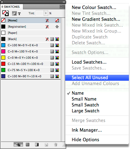
Choose Select All Unused and then click the Delete Swatch icon to get rid of unused swatches.
STEP 2: CHECK COLOURS BEFORE OUTPUT.
Next, you'll probably want to make sure that your document doesn't contain too many colours. For example, if your job is supposed to be four-colour process then you only want cyan, magenta, yellow, and black in your document. If your document is supposed to only contain black and one spot colour, then you probably don't want to see four colours.
To check this, bring up the Separations Preview palette from the Window > Output menu. It will immediately show you how many colours were used.
STEP 3: VERIFY THE STACKING ORDER.
Stacking order is important when using InDesign's transparency features. Whenever possible, place your text on top of your transparent objects. If your text is below your transparent objects, it can become rasterised. To make sure your transparent objects are set up correctly, bring up the Flattener Preview from the Window > Output menu. Choose All Affected Objects in the Highlight pop-up menu. This will highlight in red anything that either has transparency or anything that's under a transparent object. Make sure your text doesn't turn red. If it does, then arrange your text so that it's on top.
STEP 4: CHECK FOR OVERPRINTING.
By default, overlapping colours are set to knock out. If any of your objects are set to overprint, you may get unexpected colour results. Or if you have set some of your objects to overprint, then you may want to verify that you set them properly. Simply choose Overprint Preview from the View menu. This will show you the overprint results. Be sure to turn it off when you're done as it will cause InDesign to run slower.
STEP 5: PACKAGE THE DOCUMENT.
The Package function (File > Package) will run InDesign's built-in Preflight. Preflight is great because it can warn you about missing links, missing fonts, and images in the wrong colour space. Unfortunately, most of these errors have to be fixed in InDesign. If you receive an error that needs fixing, simply cancel and go fix the error and then run Package again. Once it satisfies the Preflight function, you'll be able to choose a location such as your Desktop and package a copy of the document, links, and fonts to this folder, which you can then give to your print service provider.